
Mobile-First Design: Why Your Website Must Prioritize Mobile Performance

The Mobile Revolution is Complete
Mobile internet usage surpassed desktop in 2016 and never looked back. Today, over 60% of web traffic comes from mobile devices, with some industries seeing 80%+ mobile usage. Yet many websites still treat mobile as an afterthought.
Google recognized this shift and implemented mobile-first indexing, meaning they now use the mobile version of your site for ranking and indexing. If your mobile site performs poorly, your search rankings suffer across all devices.
What Mobile-First Design Really Means
Mobile-first design isn't just about making your site work on phones. It's a fundamental approach to web development that prioritizes the most constrained environment first:
- Start with mobile constraints: Limited screen space, slower connections, touch interfaces
- Layer on desktop enhancements: Add features and layouts that take advantage of larger screens
- Optimize for performance: Every element must justify its impact on mobile load times
This approach ensures your site performs excellently across all devices rather than being merely "responsive."
The Performance Imperative
Mobile users are less patient than desktop users. While desktop users might wait 3-4 seconds for a page to load, mobile users expect sub-2-second performance:
Mobile User Behavior:
- 53% abandon sites taking longer than 3 seconds to load
- 70% expect pages to load as fast on mobile as desktop
- 85% expect mobile sites to be as good or better than desktop versions
Connection Reality:
- 4G isn't available everywhere
- Even 4G speeds vary dramatically
- Users often have limited data plans
Core Principles of Mobile-First Development
1. Content Hierarchy and Prioritization
Mobile screens force tough decisions about what content matters most:
- Lead with primary actions: What do users need to accomplish?
- Simplify navigation: Reduce cognitive load with clear, minimal menus
- Prioritize above-the-fold content: The first screen must deliver immediate value
- Progressive disclosure: Reveal additional content as users engage
2. Touch-Optimized Interface Design
Mobile interfaces require different interaction patterns:
- Minimum touch targets: 44px minimum for clickable elements
- Thumb-friendly zones: Important actions within easy thumb reach
- Gesture support: Swipe, pinch, and scroll interactions
- Avoid hover states: Design for touch, not mouse cursors
3. Performance-First Asset Strategy
Every resource must earn its place on mobile:
- Critical path optimization: Load essential content first
- Image optimization: WebP formats, responsive images, lazy loading
- Minimal JavaScript: Every script impacts performance
- Efficient fonts: System fonts or optimized web font loading
Technical Implementation Strategies
Responsive Breakpoints
Design for real device usage patterns:
/* Mobile first: Base styles for 320px+ */
.container { width: 100%; padding: 1rem; }

/* Small tablets: 768px+ */
@media (min-width: 48em) {
    .container { max-width: 750px; margin: 0 auto; }
}

/* Desktop: 1024px+ */
@media (min-width: 64em) {
    .container { max-width: 1200px; display: grid; }
}
Image Optimization for Mobile
Deliver the right image for each device:
<picture>
    <source media="(max-width: 767px)"
            srcset="mobile-image.webp 400w">
    <source media="(min-width: 768px)"
            srcset="desktop-image.webp 800w">
    <img src="fallback-image.jpg" alt="Description">
</picture>
Progressive Enhancement
Build features that work everywhere, then enhance:
- Base functionality: Works without JavaScript
- Enhanced interactions: Add JavaScript for improved UX
- Advanced features: Utilize modern browser capabilities
Common Mobile Design Mistakes
Desktop-Down Thinking
Starting with desktop designs and trying to cram them into mobile creates:
- Overcrowded interfaces
- Poor performance
- Frustrated users
- Lower conversion rates
Ignoring Touch Patterns
- Buttons too small to tap accurately
- Important actions in hard-to-reach areas
- Hover effects that don't work on touch
- Dense layouts requiring precise tapping
Performance Afterthoughts
- Large images that slow mobile loading
- Excessive JavaScript for mobile interactions
- Unoptimized fonts and resources
- Render-blocking assets
Mobile-First SEO Benefits
Google's mobile-first indexing rewards sites built with mobile priority:
Ranking Factors
- Page load speed: Faster mobile sites rank higher
- Core Web Vitals: Mobile performance metrics affect rankings
- User experience: Mobile usability impacts search visibility
- Content accessibility: Mobile-optimized content gets indexed better
Technical SEO
- Structured data: Must work correctly on mobile
- Internal linking: Navigation must be mobile-friendly
- Page depth: Important content should be easily reachable
- Local SEO: Mobile optimization crucial for local search
Measuring Mobile Success
Track these key metrics to evaluate mobile performance:
Performance Metrics
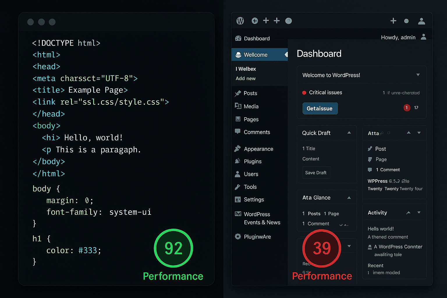
- Mobile PageSpeed score: Target 90+ on mobile
- First Contentful Paint: Under 1.5 seconds
- Time to Interactive: Under 3 seconds
- Cumulative Layout Shift: Under 0.1
User Experience Metrics
- Mobile bounce rate: Should be comparable to desktop
- Mobile conversion rate: Track mobile-specific goals
- Session duration: Engaged mobile users stay longer
- Page views per session: Quality mobile UX encourages exploration
Real-World Mobile Impact
Case Study: E-commerce Site Redesign
Before Mobile-First Approach:
- Mobile bounce rate: 78%
- Mobile conversion rate: 1.2%
- Mobile page load time: 4.8 seconds
After Mobile-First Redesign:
- Mobile bounce rate: 32%
- Mobile conversion rate: 3.7%
- Mobile page load time: 1.1 seconds
Business Results:
- 208% increase in mobile revenue
- 65% improvement in mobile search rankings
- 45% increase in overall site traffic
Future-Proofing with Mobile-First
Mobile-first design prepares your site for emerging trends:
- 5G adoption: Enables richer mobile experiences
- Progressive Web Apps: Mobile-first PWAs feel like native apps
- Voice search: Mobile users drive voice search adoption
- IoT devices: Mobile-optimized sites work better on smart devices
The Business Case for Mobile-First
Mobile-first design isn't just about user experience, it's about business survival:
Revenue Impact
- Mobile commerce continues growing year-over-year
- Mobile-optimized sites convert better
- Better mobile UX reduces customer acquisition costs
Competitive Advantage
- Most sites still prioritize desktop
- Mobile-first sites stand out in search results
- Superior mobile experience builds customer loyalty
Operational Efficiency
- Single codebase serves all devices
- Easier maintenance and updates
- Better performance monitoring
Getting Started with Mobile-First
Transitioning to mobile-first development requires:
- Audit current mobile performance: Identify pain points
- Prioritize content and features: What matters most to mobile users?
- Design for constraints: Start with smallest screen, work up
- Test on real devices: Emulators don't show the full picture
- Monitor mobile metrics: Track performance and user behavior
Mobile-First is Business-First
In today's mobile-dominant world, mobile-first design isn't optional. It's the foundation of successful web presence. Sites that prioritize mobile performance, usability, and experience win customers, search rankings, and revenue.
Your mobile site isn't a secondary version of your "real" website. For most of your visitors, it IS your website. Make sure it delivers the fast, smooth, engaging experience that drives business growth.